Don’t know about you, but I find that CMYK neutrals look too neutral and lack the warmth you find in real print jobs.
A proof can’t recreate the subtle warmth that you get from the order that the inks are laid down. The waxiness of the top coat of process yellow.
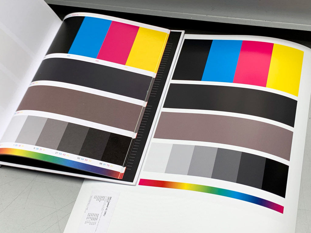
On the left a page from Color Library, a very useful book from the Workflow project at ECAL/University of Art and Design Lausanne.
On the right a GMG Fogra 39L contract proof using the same colours and tints.